

Every so often I come across a memento of one of our old products, a newspaper clipping, at one point even doing my VAT return or the end of year accounts would bring back a pang of nostalgia to the heady, chocolate fuelled days when we first started. My team know all too well just how emotional and quite sentimental I get, they started taking bets each Christmas about how long it will take me to well up! I'm definitely a hoarder, I don't throw anything out unless I really have to, nearly everything has the potential to be recycled into something new, you never know when we might really need it. So parting with something that has been with us for so long, which has been a fundamental image and foundation of our identity has been a very challenging experience.
This week sees us changing our York Cocoa House logo, and I will be the first to admit it's not been an easy experience! It was mid October 2011, I'd met with 2 designers who were keen to develop their branding careers, I'd agreed to the lease on 3 Blake Street and was anxiously waiting for the legal work to come together to open before Christmas, it seemed to stall and take forever, and I wasn't entirely convinced it was really going to happen so was trying not to commit much money to it unless I had the firm go ahead. I had been looking for somewhere for so long, I was certain this place would fall through as well, or something wouldn't be right enough, but it started to emerge that it really was going to happen and I needed a logo at the very least. I had a really clear idea about what I wanted, I just had no idea how to communicate it. Having just found a collection of those original designs its fascinating to see the evolution of our ideas and vision as it was back then. It had to be elegant, a reflection of the historic significance of York and its Chocolate industry, be reflective and respectful of an era when York's manufacturing was a scene of splendour. The first few designs were not going in the right direction, my instructions went back - more cursive, more elegant, more alive, less dense, bigger roses.
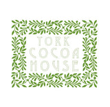
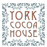
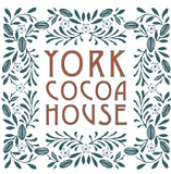
Our final design served us well over the last 6 years. We never used the 2 tones of the brown and green, mostly because I ended up creating design material myself when resources got tight and we had to put up with my limited design skills to see us through.
Back then our values where very much intertwined with my own identity and the story I wanted to be able to tell, York is a city of immense chocolate heritage with thousands of stories to tell. Those values still ring true today, and continue to be at the heart of our passion and business, however we now must look to the future. There are now many exciting chocolate offerings around the city that can tell you the story and celebrate York's chocolate heritage, with that story now in safe hands, we want to be able to look to the future of the industry that has inspired us and ensure that York can be part of shaping that future.
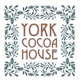
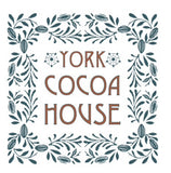
The team at Lazenby Brown have been supporting us with our design work for the last 4 years, it was clear my limited design skills would not get us very far, so needed to put the brand and vision into the safe hands of a very talented design team I had the pleasure of working with on a number of occasions. Mat and Gary are more than just a design team, they have the ability to visualise, articulate and create the very essence of an identity. I asked them for their help and they asked me to trust them. With their help and support they took us on a journey, identifying what was really at the heart of our chocolate making vision and ambition.
It's been a very existential process that has enabled us to become stronger as a team because of it. It's taken my little idea of creating a chocolate factory into a real, tangible story that we can share with our customers. It's been interesting, fascinating, reflective and inspiring. It's liberated us from a brand logo that appeared on products, on our windows and our walls and helping us transform into something that can now explore all the avenues and directions that chocolate and cocoa can take us.
I still adore our original design and will look at it so fondly for it created our identity and told our story, but now it is time to move forward onto our next chocolate making adventure and prepare for our story to be able to be told across more locations, products and experiences.
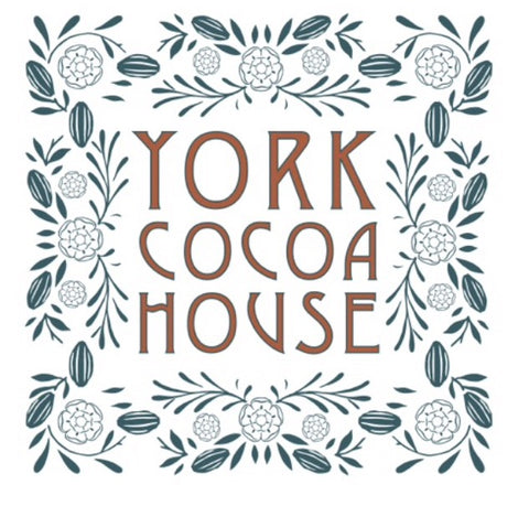
I love what Lazenby Brown have created, and even more so for the journey it has taken us through, it puts the 2 most important essences of our brand - York and Cocoa, symbolised by the pod and the Yorkshire Rose at the heart of our identity. This week it will start to adorn our windows, our products, our website, your gifts this Christmas and our new York Cocoa Works site at 10 Castlegate.
Our new chapter is coming, we hope you will join us as York Cocoa House & York Cocoa Works bring real, fine chocolate making back to York.


Comments (0)
There are no comments for this article. Be the first one to leave a message!